There’s something oddly satisfying about taking a small, self-contained piece of hardware and bending it to your will—especially when it starts life as a fairly generic dev board and ends up as a polished, purpose-built interface.
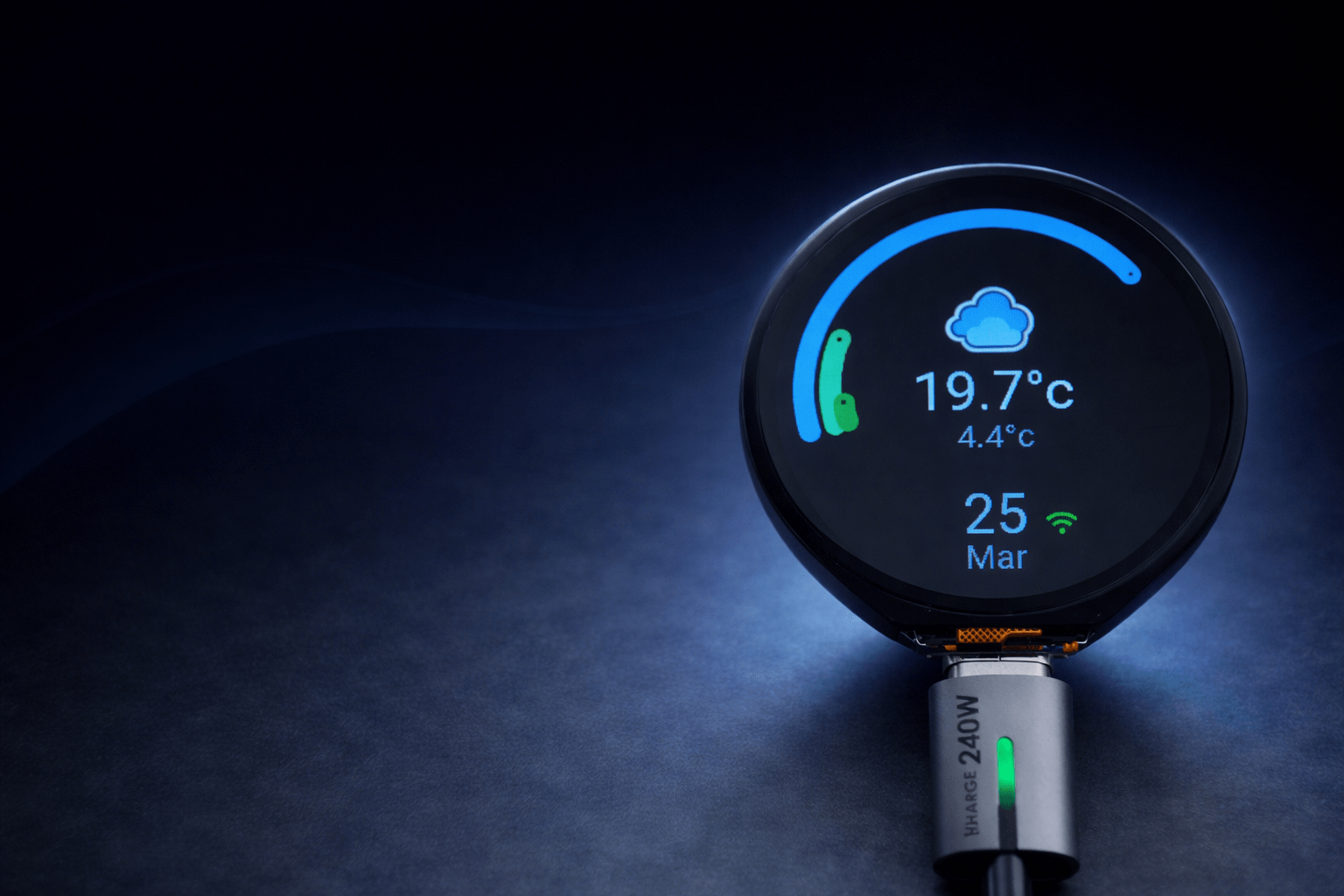
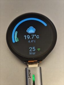
This project started with one of those deceptively simple components: a small round LCD display from Waveshare, driven by an ESP32-S3. You can find the device I used here on Amazon. The goal wasn’t just to “get it working,” but to turn it into a genuinely useful, responsive, and visually clean interface that could integrate tightly with Home Assistant.
What followed was a mix of experimentation, frustration, and the occasional “why is this even doing that?” moment.
The Goal
At a high level, the idea was straightforward:
- A compact, circular display
- Touch/gesture-based navigation
- Real-time data from Home Assistant
- Clean, readable UI with minimal clutter
- Adaptive brightness depending on environment
In reality, each of those bullet points hides a surprising amount of complexity.
Why ESPHome + LVGL?
ESPHome made sense as the foundation—it integrates natively with Home Assistant and removes a lot of the boilerplate you’d normally deal with in embedded development.
But for the UI side, LVGL (Light and Versatile Graphics Library) was the real enabler.
It gives you:
- Proper layout systems
- Widgets (labels, arcs, images, etc.)
- Animations and transitions
- A structured way to build multi-screen interfaces
That said, “lightweight” doesn’t always mean “simple.”
Hardware Overview
The core of the setup:
- ESP32-S3-based round display module
- Integrated circular LCD (typically 240×240 or similar)
- Capacitive touch support (gesture detection handled in ESPHome)
- Backlight control via PWM
Physically, it’s a great form factor for dashboards, gauges, or status displays—but the circular layout introduces some interesting design constraints.
Designing for a Round Display
The biggest shift from traditional UI work is this:
You don’t have corners.
Everything needs to feel centred and balanced. Rectangular layouts look awkward very quickly.
What worked well:
- Radial elements (arcs for gauges, circular indicators)
- Centrally aligned text
- Minimalist layouts
What didn’t:
- Trying to “force” grid layouts
- Overloading the screen with information
- Small text near the edges (gets visually lost)
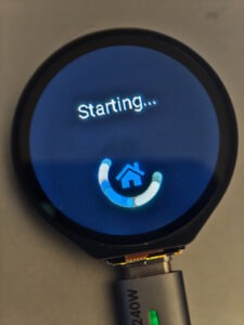
Multi-Screen Navigation
Rather than cramming everything onto one screen, the UI is split into multiple pages:
- Main dashboard (weather, status, key metrics)
- Debug/system info screen
- Context-specific views (e.g. bin collection info)
Navigation is gesture-based:
- Left/right → switch main sections
- Up/down → sub-pages within a section
This ended up feeling far more natural than buttons, especially on a small screen.
Dynamic Data from Home Assistant
The real value comes from live data.
Examples of what’s displayed:
- Weather conditions (with matching icons)
- Network stats (IP, Wi-Fi strength)
- Sensor data (custom entities like bin collection schedules)
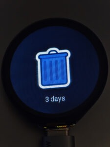
One interesting challenge was mapping Home Assistant states to assets.
For example:
- A sensor returns a string like
"General Waste Tomorrow" - The UI extracts the first word
- That maps to an image file (
general.png, etc.)
It’s simple logic, but it creates a flexible system where the UI adapts automatically.
Weather Icons & State Mapping
Weather turned out to be more fiddly than expected.
Home Assistant uses a set of condition states like:
sunnypartlycloudypouringlightning-rainy
To keep things maintainable:
- Image paths were standardised
- File names matched condition states exactly
- Separate folders for small vs full-size assets
This avoids messy condition mapping logic and keeps everything predictable.
Brightness Control (Day/Night Logic)
One of the more “invisible but important” features.
The display shouldn’t:
- Blind you at night
- Be unreadable during the day
So brightness is driven by a Home Assistant sensor (e.g. civil daylight detection), with:
- Separate min/max values for day and night
- Smooth transitions instead of abrupt jumps
- A dimming timer to reduce brightness after inactivity
This ended up being more complex than expected, mostly due to timing and state handling—but it makes a huge difference to usability.
Debug Screen (More Useful Than Expected)
Initially added just for development, the debug screen became genuinely useful.
It shows things like:
- Wi-Fi SSID
- Signal strength
- IP address
- Connection status to Home Assistant
When something breaks (and it will), having that visibility directly on the device saves a lot of time.
Challenges Along the Way
A few notable pain points:
1. YAML + LVGL Complexity
ESPHome abstracts a lot, but once you start layering LVGL components, conditions, and actions, things can get messy quickly.
Small mistakes can lead to:
- Silent failures
- Broken layouts
- Odd rendering issues
2. Animation & Styling Quirks
Things like arcs, opacity, and transitions don’t always behave intuitively.
You’ll tweak one property and suddenly:
- Something disappears
- Or renders incorrectly
- Or ignores your settings entirely
A lot of this came down to trial and error.
3. Resource Constraints
Even on an ESP32-S3, you’re still in embedded territory.
- Large images need resizing
- Fonts need careful selection
- Too many elements can slow things down
Optimisation isn’t optional—it’s part of the design process.
What It Became
By the end, this wasn’t just a “display project” anymore.
It became:
- A modular UI framework for small embedded screens
- A reusable pattern for Home Assistant dashboards
- A stepping stone toward more advanced interfaces (HUDs, gauges, etc.)
And more importantly—it actually feels good to use.
Where This Leads Next
This kind of interface opens the door to a lot of interesting directions:
- Dedicated automotive displays
- Smart home control panels
- Portable diagnostic tools
- Real-time telemetry dashboards
The same principles apply—just scaled and adapted.
Final Thoughts
This project sits right at the intersection of embedded development, UI design, and systems integration.
It’s not just about getting pixels on a screen—it’s about:
- Making data meaningful
- Designing for constraints
- Building something that feels intentional
And as with most projects like this, the real value isn’t just the end result—it’s everything learned along the way.
If you’ve been thinking about building your own custom display or dashboard, this is one of those projects that looks simple on the surface… but goes as deep as you’re willing to take it.
This page contains affiliate links with Amazon, and do not impact the price you pay or offers you receive, but may generate commission on purchases you make that help me maintain the site and continue to produce future content
Comments are closed